Scrap Lab Formula to Create a Stunning Scrappy Quilt
Wondering how to craft a custom fabric bundle from your stash to create the perfect cozy scrappy quilt? Picture a scrappy quilt draped across the couch for family movie night, or wrapped around you on a rainy day with a book and coffee. That dream becomes reality with the right fabrics.
Before I took a hiatus in quilting, custom curated bundles were not something I was aware of. Pre-cut fabrics bundled by fabric designers were readily available. Bundles of fabric from one designer line assembled by the manufacturer provided instant coordination. The colors and prints coordinated, sometimes too perfectly. It was an affordable way to get every fabric in a design line.
Custom curated bundles let you combine fabrics from different lines into a story through color and texture. Using leftovers from your stash adds joy and history to your scrappy quilt.

DREAM BIG, THEN SEW BIG WITH A CLEAR PLAN
The depth of color is crucial when creating a color palette. If all the fabrics in a quilt have similar value—the relative lightness or darkness of the color—the quilt can feel flat. Color value is how we see the lightness or darkness of a fabric, regardless of its actual color. For example, if you imagine a color with less grey, it appears lighter; with more grey, it appears darker. By balancing light, dark, and in between fabrics, you create a visually interesting and dynamic scrappy quilt.
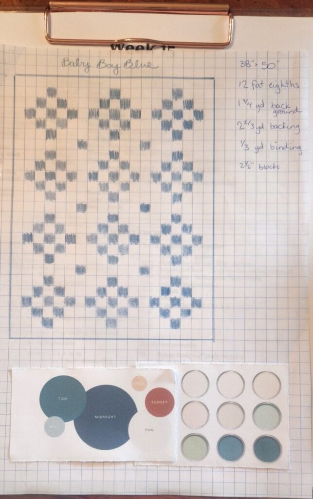
5 steps to planning a color palette for a scrappy quilt:
Step 1: Consider your quilt pattern. This will determine your color palette. Assess if the pattern is simple or complex, the number of blocks, block size, suitability for scrappy or classic styles, and whether sashing or plain backgrounds change the look. The same nine-patch block creates different effects with different layouts.
Step 2: Choose a main color. One that will make up more than 50% of the design. Even a scrappy quilt has a dominant color, sometimes in the background, other times throughout the blocks.
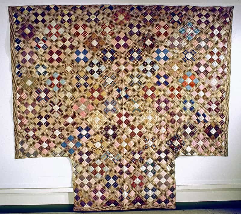
Step 3: Add complexity with more color to create contrast. Accent colors tie the palette together and add harmony—placing diverse colors side by side creates a pleasing effect. Working with many fabrics is easier: while three are tough to coordinate, ten are easier, and over a hundred fit together well. Clashing colors are softened with several complementary fabrics in between.
Step 4: Repeat the main color in various values—light, medium, and dark—to add texture, depth, and visual interest. Contrast keeps the eye moving. Even in a low volume quilt, variations from crisp white to pale linen, accented with blues, greens, golds, and pinks, add cohesion and warmth. Bright quilts can be varied by keeping value constant but changing the white content in prints.
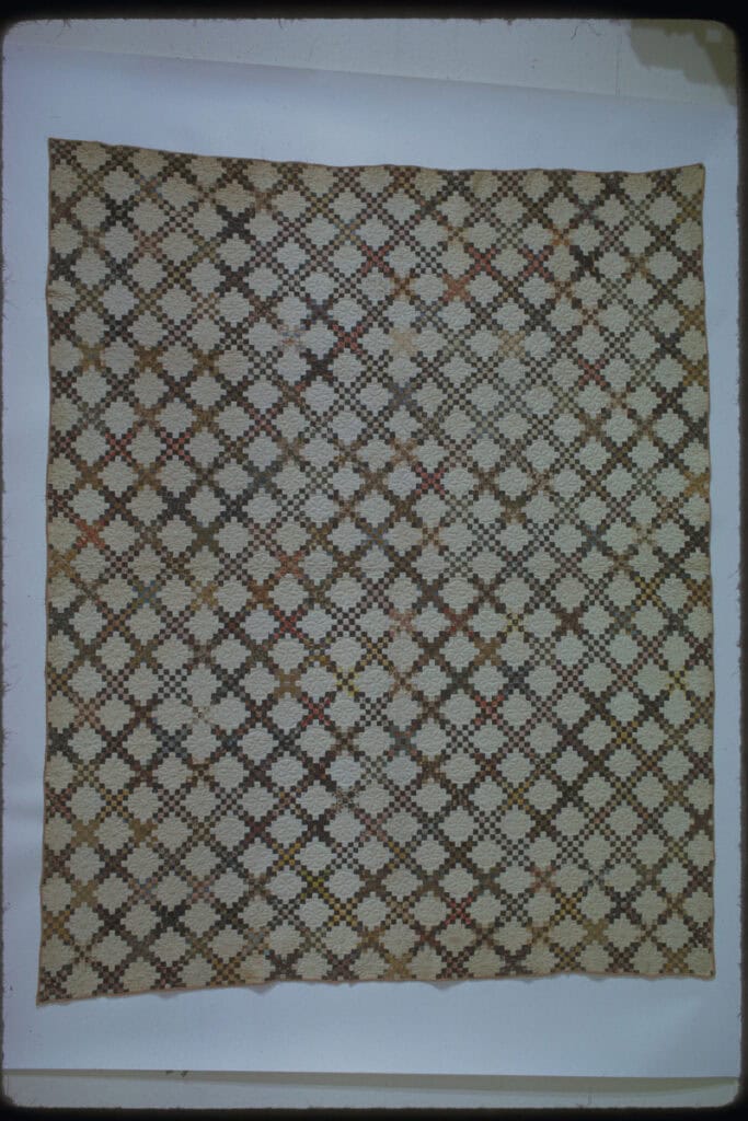
Step 5: Complexity over simplicity. The key here is still using colors that complement each other. Too many different colors create chaos. The more values you layer of the same color family, the richer the result. When the colors connect, the quilt feels cohesive. The eye moves across a quilt as the complexity of variations on the same color adds depth to the color palette. It is what gives a quilt that cozy yet beautiful look.
YOU DO NOT NEED EXPENSIVE OR FANCY FABRIC TO MAKE A BEAUTIFUL QUILT
Use your scraps and fabric you like. Whether background or prints, your arrangement and color choices of fabric you love make the quilt beautiful.
How to balance color?
Color is a key component. A good rule of thumb is to pick one color to be a neutral and then build from there. This is usually the background color. Consider also the contrast in the colors. Sometimes a small accent of a contrasting color, a little out of order, is good. Adding a pop of color to the center of each block adds a layer of complexity, keeping the eye moving. The eye also needs a place to rest, though. Neutrals are the calm to the storm and give the eye a place to rest.
There is a place for low volume quilts, similar to a white kitchen. The key is accent colors, even in a low volume bundle. Adding beige, tan, and grey to a white low volume background gives depth to the color palette and keeps the quilt from appearing flat or plain. Variations of white, each adding texture and depth, keep the eye moving around the quilt, and that’s what makes a color palette complement the quilt design.
Next, shift your attention from color to prints: How to balance prints?
Scale of the print is a key component. Yet it is highly dependent on the block size. A large scale print fabric, one with a large print or large design, can hide in a small block piece. Conversely, a small scale print fabric can be viewed as a solid in a large block piece. Limit busy prints, prints that seem visually overwhelming, to the same or similar scale if the print has a large variety of colors.
Above all, remember the heart of your project: You need fabric that tells a story.
Use your scraps or any fabrics meaningful to you. You get to tell your quilt’s story.
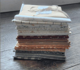
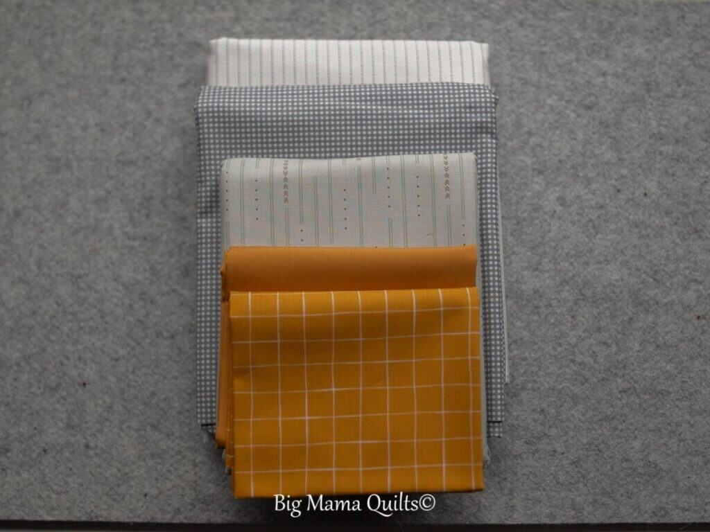
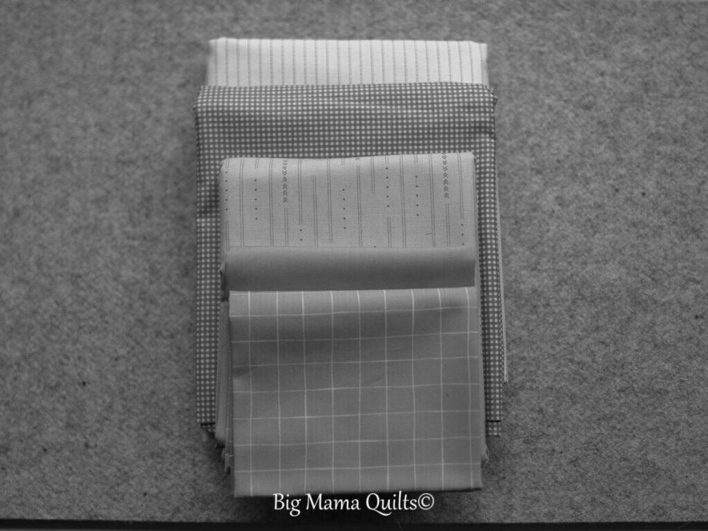
If you don’t have any scraps or only a few, begin with a curated bundle. Add solids and other prints from your stash. Choose colors that are similar but not in the same value range.
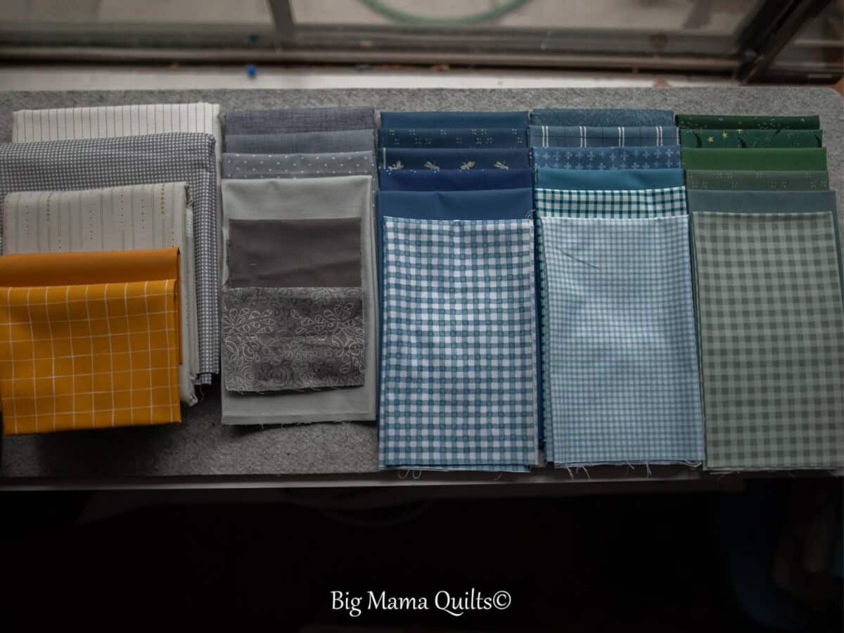
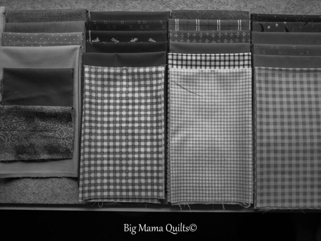
One way to see the value range of your fabrics is to take a black and white photo. You can quickly see how similar in value the blues and greens are. The old adage ‘blue and green should not be seen without a color in between’ holds true here. Because blue and green are next to each other on the color wheel, the eye perceives them as the same color. You can quickly pick out the darks, mediums, and lights from this photo, but not necessarily the blues from the greens. Grey is a neutral — its value is also considered the same. The gold, though, is so much lighter than the dark and medium blues and greens. The gold will make a great fabric ‘in between’ the greys, blues, and greens. It will provide the contrast to keep the eye moving. The variety of patterns and scale of patterns will also give the eye something to search for. The solids will give the eye a place to rest. Therefore, this custom bundle, created from my fabric stash with a few new fabrics added, will make a stunning scrap quilt.
Closely look at the quilts you love. Notice the use of color and prints. The best way to train your eye is to study what attracts your eye. Then imitate it. I am always learning, along with everyone else. There will always be someone who does it better.